Write Better Prompts for Krea 2 Images
Last Updated
Sep 8, 2026
Models Tested
Krea 2 Medium, Krea 2 Turbo
Introduction to Krea 2
Krea 2 is Krea's first image model trained from scratch, and it was built around one idea: the model should be able to render almost any style, from grainy 35mm film to clean anime cels to thick gouache brushwork, without drifting back toward a single polished house look. That makes it unusually rewarding to prompt, and unusually literal about the style words you give it.
This guide covers how Krea 2 reads a prompt, the one rule that matters most, a draft-then-commit workflow using Krea 2 Turbo and Krea 2 Medium, and a playbook of styles it handles well. Every example image below was generated with Krea 2 in the Ambience AI image generator, and the prompt shown is exactly what was typed.
What Is Krea 2?
Krea 2 is a family of text-to-image models from Krea, trained from the ground up for stylistic range and creative control rather than for one default aesthetic. Where many models push every prompt toward the same glossy, high-contrast render, Krea 2 is happy to give you something grainy, washed out, flat, or hand-made when you ask for it.
Krea 2 Medium
The main model. Strong, stable results for photoreal film looks, anime, and painted styles. ~2 minutes per image, 30 credits.
Krea 2 Turbo
The fast draft model. Same style range, less polish, back in ~2 seconds for 15 credits. Use it to try an idea several ways before committing.
Five Aspect Ratios
Pick 1:1, 16:9, 9:16, 4:3, 3:4 in the dimension selector. Krea 2 Medium has no native 3:4, so that choice renders at its nearest ratio, 4:5.
Seeds for Repeatability
Fix a seed and re-run the same prompt on Turbo and Medium to compare a draft against the finished render.
How Krea 2 Reads a Prompt
Krea 2 does not settle on one canonical picture for a short prompt. Give it "a cat riding a bicycle" and a batch will spread across photography, cartoon, and painting. Add a medium and it narrows to that lane while staying varied inside it. Krea describes this as exploring first and tightening later, and it is the mental model the rest of this guide builds on.
Name the Medium First
If you remember one thing from this guide, make it this: Krea 2 commits hard to whichever medium it infers. Leave the medium out and it will pick one for you, often a different one each time. Name it, and everything else in the prompt gets interpreted through that lens.
"Medium" means the physical or digital process that would have made the picture. Lead with it, and be specific:
Specific Mediums That Work
- "35mm film photograph"
- "macro photograph"
- "anime illustration, cel shading"
- "gouache painting on textured paper"
- "risograph print"
- "ligne claire illustration"
- "3D render"
- "extremely grainy lo-fi VHS still"
Vague Labels That Drift
- "beautiful" or "high quality"
- "artistic"
- "realistic" on its own
- "digital art" with no technique
- "cinematic" with no film reference
These tell Krea 2 how you feel about the image rather than how it was made, so it guesses.
Example: A Film Photograph
Prompt:
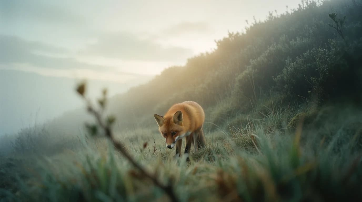
"a lone red fox on a misty hillside at dawn, 35mm film photograph, shallow depth of field, fine grain, soft backlight through the fog, muted green and amber palette"
Why It Works:
- "35mm film photograph" sets the medium, and "fine grain" and "shallow depth of field" are things a 35mm lens would actually do
- The palette is named outright, so the fog reads as muted green and amber instead of default blue-gray
- Nothing in the prompt says "photorealistic"; the medium implies it
Example: A Gouache Painting
Prompt:
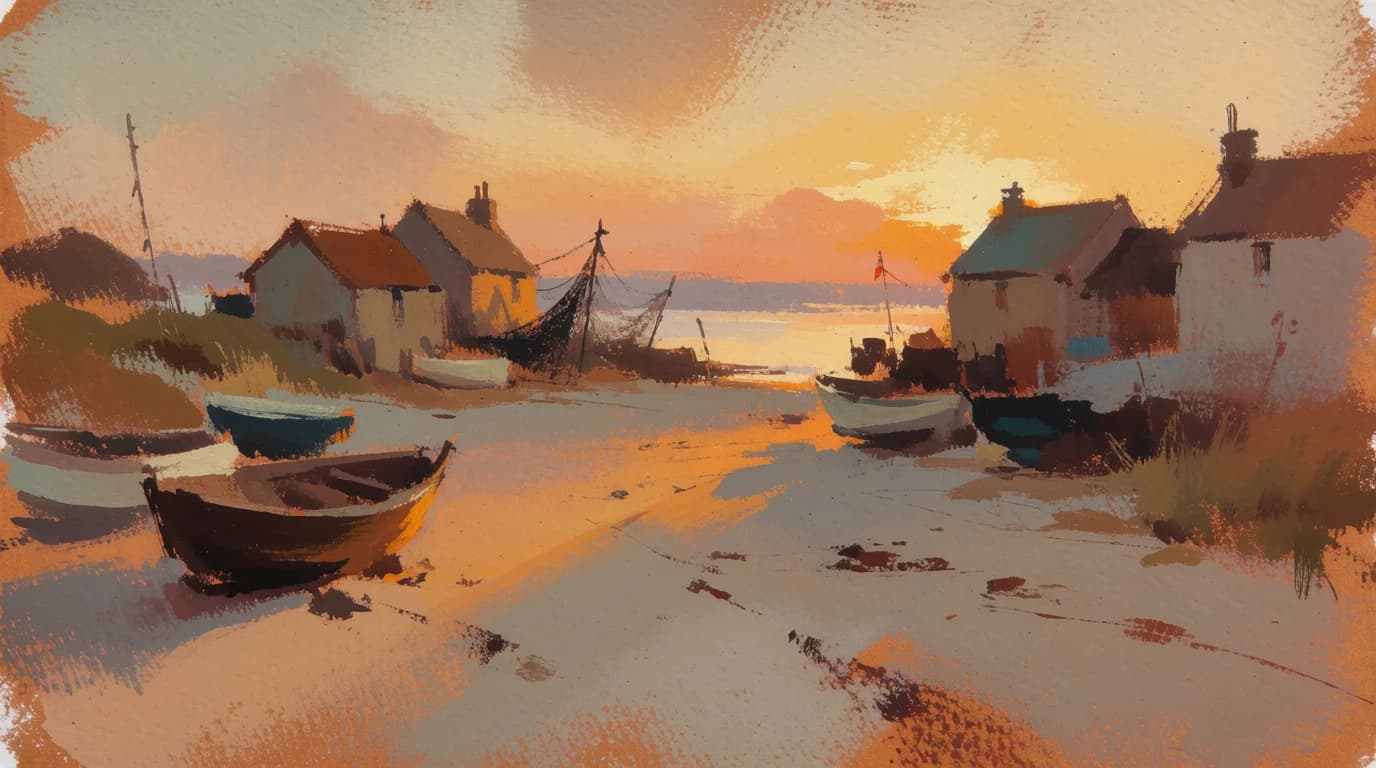
"gouache painting, a fishing village at golden hour, thick visible brushstrokes, textured paper, warm ochre and teal palette, boats pulled up on the sand, loose painterly edges"
Why It Works:
- "Gouache" is a specific opaque paint, and Krea 2 renders its matte, chalky surface rather than generic "painting"
- Texture cues ("thick visible brushstrokes", "textured paper") tell the model what the surface should feel like
- "Loose painterly edges" gives permission to be imprecise, which is the look
The Five-Attribute Stack
After the medium, Krea 2 responds best when you state five things outright instead of leaving them implied. It will fill any gap you leave, and it will not always fill it the way you had in mind.
1. Color Palette
Name two or three colors: "muted green and amber", "fluorescent pink and navy", "washed-out teal".
2. Lighting
Direction and quality: "hard directional window light", "soft backlight through fog", "glow from a CRT television".
3. Texture
What the surface is made of: "fine grain", "grainy ink texture", "condensation droplets", "tracking lines".
4. Framing
Distance and angle: "wide shot", "macro", "low angle", "close-up", "shallow depth of field".
5. What the Background Is
Say it explicitly: "solid dark background", "solid cream background", "rainy platform behind her". An unmentioned background is where Krea 2 invents the most.
Example: All Five in One Prompt
Prompt:
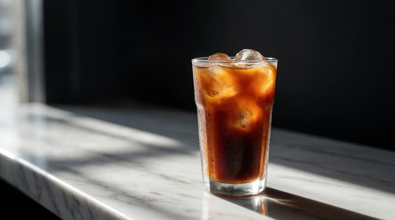
"macro photograph, a glass of iced coffee on a marble counter, hard directional window light, deep shadows, condensation droplets, shallow depth of field, solid dark background"
Read It Back:
- Medium: macro photograph. Lighting: hard directional window light. Texture: condensation droplets. Framing: shallow depth of field. Background: solid dark.
- The palette is implied by marble, coffee, and a dark background, which is enough here; add colors when the subject does not carry them
Sentences or Comma Stacks, Either Works
Krea 2 reads a flowing description and a comma-separated list of attributes equally well. Pick whichever carries the detail more naturally. A comma stack is easier to edit one attribute at a time, which matters in the draft loop below. Keep it under roughly 300 words; past that, extra words stop adding signal.
Describe What You Want to See
Krea 2 treats every noun in the prompt as something to draw, so a negation can summon the thing you were trying to avoid.
- Say "shallow depth of field", not "background not sharp"
- Say "solid flat background", not "no clutter behind"
- Say "empty street at dawn", not "street with no people"
Draft on Turbo, Commit on Medium
Because Krea 2 explores rather than converges, the fastest way to a great image is to spend a few cheap drafts finding the lane, then spend one slow render finishing it. Krea 2 Turbo returns in a couple of seconds for fewer credits than Medium, and it shares Medium's style system, so what you learn on Turbo transfers.
The Loop
- Start vague on Turbo. A subject and a medium, nothing else. Generate a few and see which direction has life in it.
- Tighten one attribute at a time. Add a palette, then lighting, then framing. Change one thing per draft so you know what moved the result.
- Fix the seed. Once a draft is close, note its seed so the next change is a controlled comparison.
- Re-run on Medium. Same prompt, same seed. Medium stays in the lane you settled on and adds the polish Turbo skipped. Expect the framing to shift, since the two are different models.
Example: The Same Prompt and Seed on Both Models
Prompt:
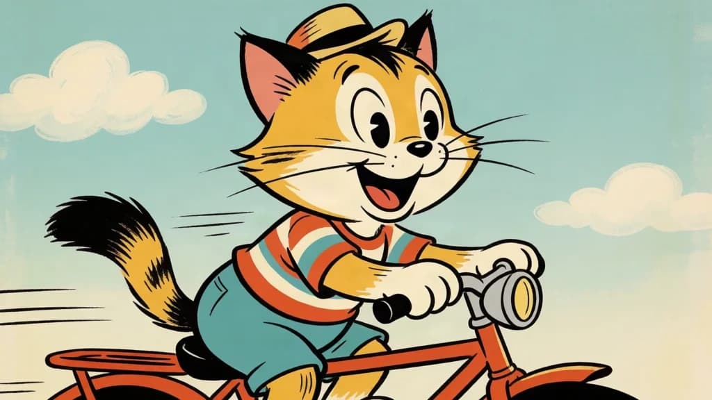
"a cat riding a bicycle, retro cartoon illustration"
Krea 2 Turbo (draft)
Krea 2 Medium (final)
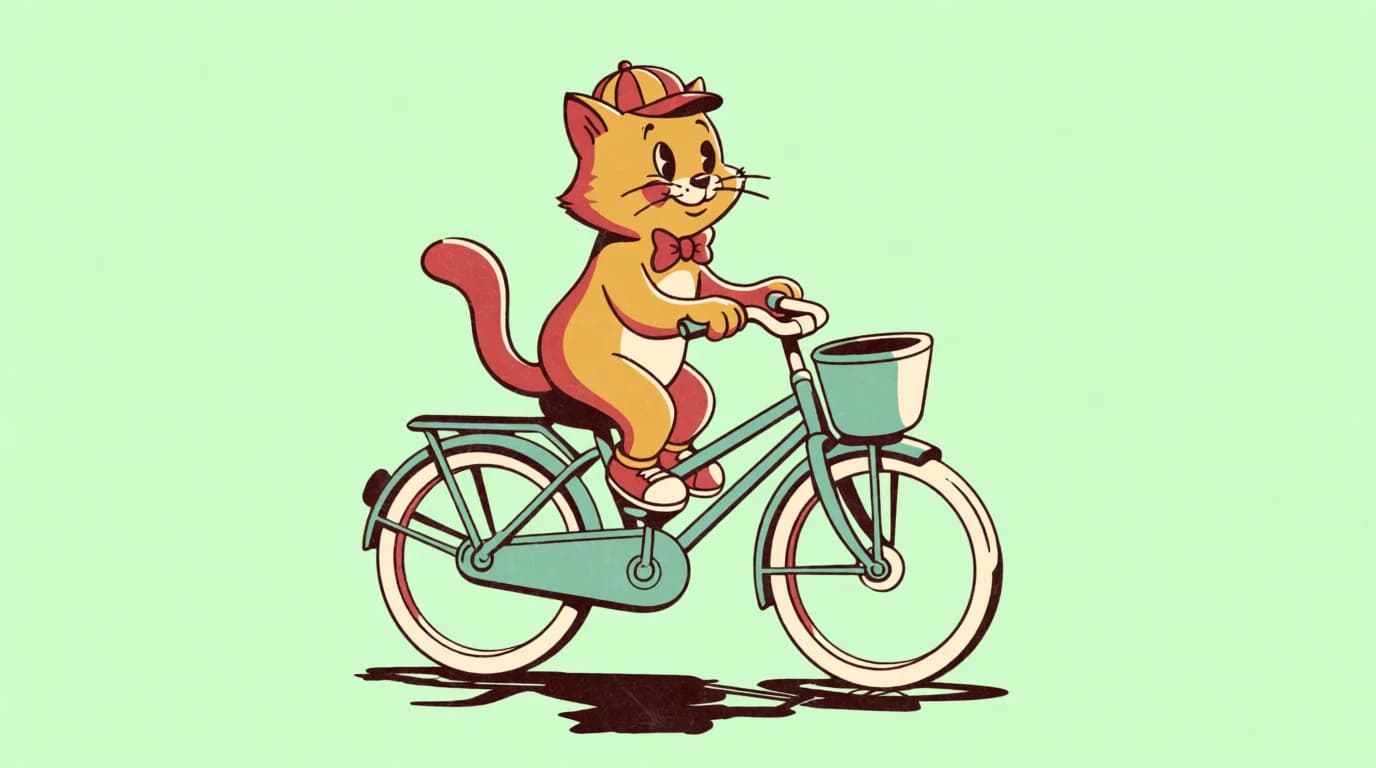
What to Notice:
- Both land in the same retro cartoon lane from an eight-word prompt, because the medium was named
- Medium and Turbo are different models, so a shared seed keeps them in the same neighborhood rather than producing pixel-identical frames
- Turbo is the one to iterate on; Medium is the one to publish
Ambience AI Expands Short Prompts for You
When you generate in Ambience AI, a short prompt is expanded with Krea-specific guidance before it reaches the model: it names the medium and technique, and it fills in any palette, lighting, texture, framing, and background cues you left out. Your original wording still steers the result, so an eight-word draft is a real draft.
Style Playbook
Krea 2 Medium is strongest in three families: photoreal film looks, anime, and painted or printed styles. It is also one of the few models that will go deliberately ugly on request. Here are prompt patterns for each, with the words that do the heavy lifting.
Anime and Cel Shading
Template:
anime illustration, [character and action], cel shading, [one light source], [reflective surface], [two-color palette], [shot size]
Prompt:
"anime illustration, a girl in a yellow raincoat waiting at a rainy train platform at night, cel shading, glowing vending machine light, reflections on wet concrete, soft blue and warm yellow palette, wide shot"
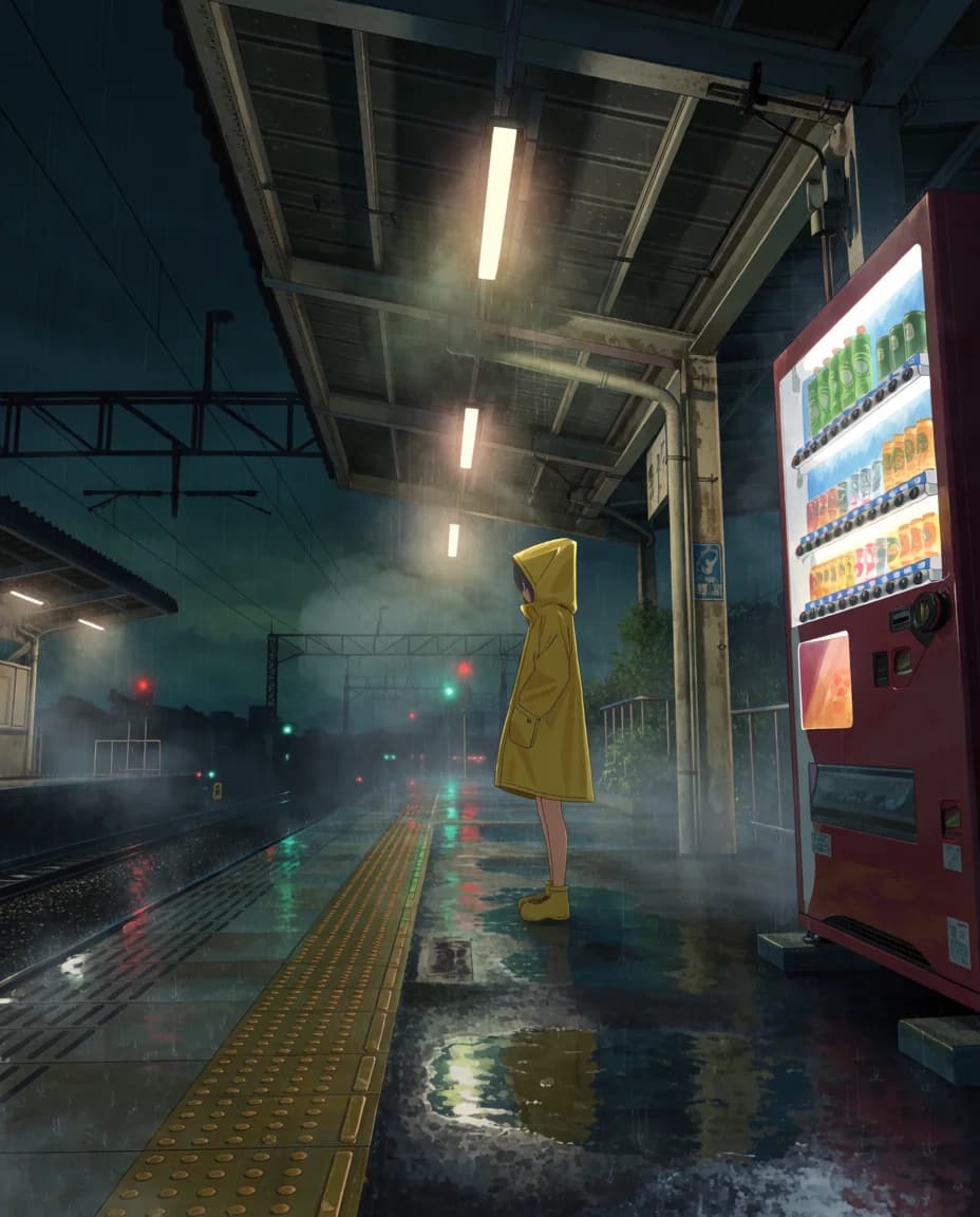
Key Tips:
- "Cel shading" is the phrase that keeps skin and cloth flat instead of drifting toward painterly rendering
- One strong practical light source (a vending machine, a lantern, a phone screen) gives anime scenes their mood
- This was requested as a 3:4 portrait; Krea 2 Medium has no 3:4 and returns its nearest ratio, 4:5. Krea 2 Turbo renders a true 3:4, so a Turbo draft can come back slightly reframed on Medium
Print and Graphic Styles
Template:
[print process], [simple subject], [N]-color limited palette of [colors], bold flat silhouettes, [process artifact], solid [color] background
Prompt:
"risograph print, a bicycle leaning against a lamppost, two-color limited palette of fluorescent pink and navy, bold flat silhouettes, slight misregistration, grainy ink texture, solid cream background"
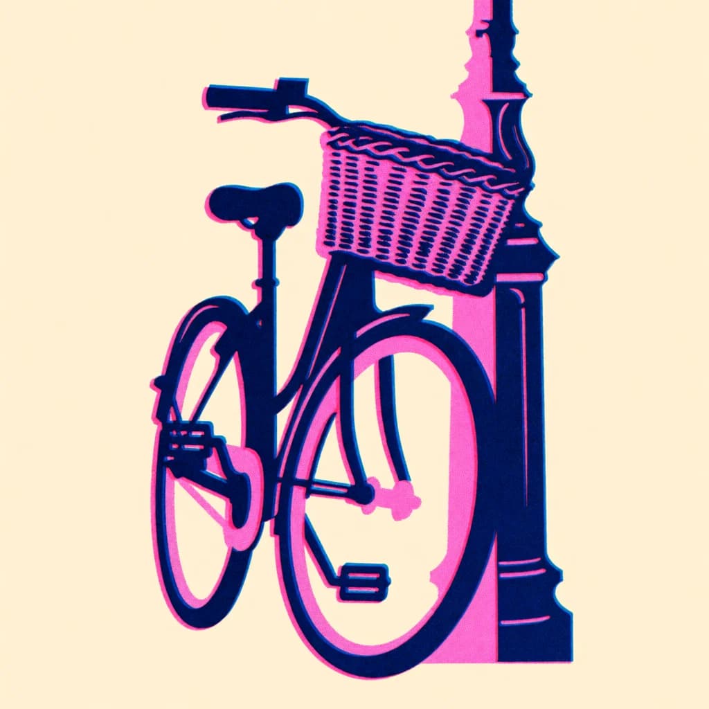
Key Tips:
- Name the process (risograph, screen print, linocut, woodblock) and its signature flaw (misregistration, ink bleed, chatter marks); the flaw is what sells it
- Limit the palette to two or three named colors and Krea 2 will honor it
- Simple subjects with strong silhouettes read best in flat print styles
Lo-Fi, Raw, and Degraded
Template:
extremely grainy [format] still, [scene], [era], [format artifacts], washed-out color, low dynamic range, [soft focus or motion blur on one element]
Prompt:
"extremely grainy lo-fi VHS still, a 1990s bedroom lit only by a CRT television showing static, tracking lines, washed-out color, low dynamic range, soft focus, a single hand entering from the edge of the frame with motion blur reaching for the remote, plain walls, bare wooden desk, unmarked cassette cases"
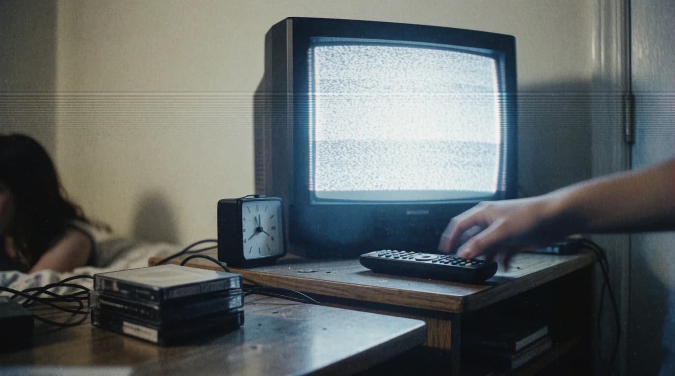
Key Tips:
- Most models quietly clean these prompts up. Krea 2 takes "extremely grainy" and "low dynamic range" at face value, so ask for the degradation you want by name
- Put motion blur on one specific element so the rest of the frame stays readable
- An era ("1990s") pulls in period-correct props without listing them. Name the props you do want ("unmarked cassette cases"), or Krea 2 will dress the set with real-world packaging
More Mediums Worth Trying
Photography: medium format portrait, disposable camera flash photo, long-exposure night photograph, polaroid, cyanotype
Illustration: ligne claire, children's book watercolor, mid-century travel poster, ukiyo-e woodblock, ink wash
Painting: impasto oil painting, acrylic on canvas, tempera, fresco, plein air oil sketch
Experimental: analog collage, photocopy zine, cross-stitch, claymation still, low-poly 3D render
Text, Editing, and Other Limits
Krea 2 is a style model, and knowing what it is not for saves credits. Route these jobs to a different model in the same image generator.
Readable Text
Krea 2 garbles headlines, labels, and signage in practice, even when the words are quoted. For posters, packaging, or UI mockups, use GPT Image 2 or Nano Banana Pro, and keep words out of Krea 2 prompts entirely.
Editing an Existing Image
Krea 2 on Ambience AI is text-to-image only. To swap a subject, change a background, or restyle a photo you already have, use Nano Banana Pro, Nano Banana 2, GPT Image 2, or Flux Kontext.
1K Output
Krea 2 Medium renders at roughly 1K on its long edge, for example 1376x768 at 16:9. That is plenty for social and web; for print, upscale the finished image afterwards.
Portrait Ratios
Choose Portrait (3:4) and Krea 2 Medium returns 4:5, its nearest native ratio, so expect a slightly squarer frame than the preview. Krea 2 Turbo renders a true 3:4. Choose 9:16 when you need a tall story frame.
Troubleshooting & Solutions
Every draft comes back in a different style
That is Krea 2 exploring. You have not named a medium, or you have named a mood instead of one. Put the medium at the front of the prompt and the spread narrows immediately.
The image looks like stock photography
"Photo" or "photorealistic" on its own lands in the generic middle. Name the camera format and its artifacts instead: "35mm film photograph, fine grain", "disposable camera flash", "medium format, shallow depth of field".
The background is busy or wrong
You left it unspecified. State what the background is ("solid cream background", "empty platform") rather than what it is not.
The colors are not what I asked for
Name the palette as colors rather than adjectives. "Warm ochre and teal" holds; "vibrant colors" does not. Two or three named colors is the sweet spot.
The text in my image is gibberish
Expected. Remove the words from the prompt and let the composition carry the message, or generate the image with GPT Image 2 or Nano Banana Pro instead.
My Turbo draft and Medium render do not match
They are different models, so a shared seed keeps them in the same lane. Expect a different frame. Treat Turbo as the place to settle the prompt, then accept Medium's version of it. If a 3:4 draft came back reframed, that is Medium snapping to 4:5.
Start Creating with Krea 2
Krea 2 rewards creators who know what they want the picture to be made of. Name the medium first, stack palette, lighting, texture, framing, and background on top, draft cheaply on Krea 2 Turbo, and commit on Krea 2 Medium. Keep words out of the frame and describe what you want rather than what you don't.
Try these patterns in our AI image generator, or browse the AI image style library for more medium and style vocabulary to paste into your next prompt.
Want to explore other models? Check out our Nano Banana Pro prompting guide for text rendering and image editing, or our Flux prompting guide for photorealistic photography.
Sources & Citations
This guide was compiled from hands-on testing in Ambience AI and the following sources:
Ready to Create Images with Krea 2?
Put your new prompting skills to use with our AI image generator. Draft on Turbo, finish on Medium, and see how far one named medium takes you.