Learn what makes a thumbnail earn the click. These 10 design rules cover contrast, composition, color, and readable text, and each one comes with a good and a bad example so you can see the difference at a glance.
10 Rules for High-CTR Thumbnails
Your thumbnail is the first thing a viewer sees, and it often decides whether they click. Work through these rules one at a time, then put them into practice with our AI YouTube thumbnail generator.
1
Build high contrast between subject and background
Strong contrast makes your subject pop the instant someone scrolls past. Place a bright, well lit subject against a darker or simpler background so the eye lands on it first. High contrast keeps your thumbnail readable even as a small preview in a crowded feed.
Fill 40 to 60 percent of the frame with an emotive face
Faces draw human attention faster than almost anything else in a feed. Fill 40 to 60 percent of the frame with a clear, expressive face so viewers feel the emotion of your video before they read a single word. A genuine expression invites the click.
Viewers skim thumbnails in a fraction of a second, so give them three punchy words at most. Short text is easy to read at any size and leaves room for your subject to shine. Save the full story for your title and description.
Bold sans-serif type reads clearly across phones, tablets, and TVs. Add a thick outline or a drop shadow so your words stay crisp against any background. Readable text turns a glance into a click.
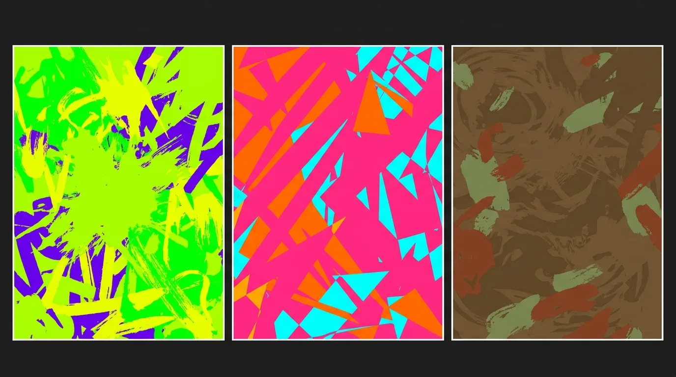
Picking two or three signature colors and using them across every thumbnail helps viewers recognize your channel at a glance. A consistent palette builds familiarity and makes your videos feel like a set. Choose colors that reflect your content and stick with them.
Place your subject off-center with the rule of thirds
Placing your subject along a third of the frame creates natural balance and energy. Off-center composition leaves room for text and guides the eye through the image. The rule of thirds gives even simple thumbnails a polished, intentional feel.
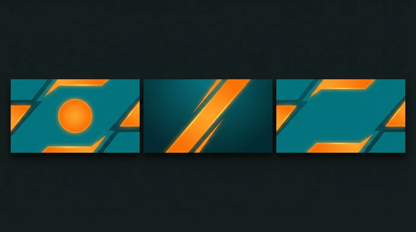
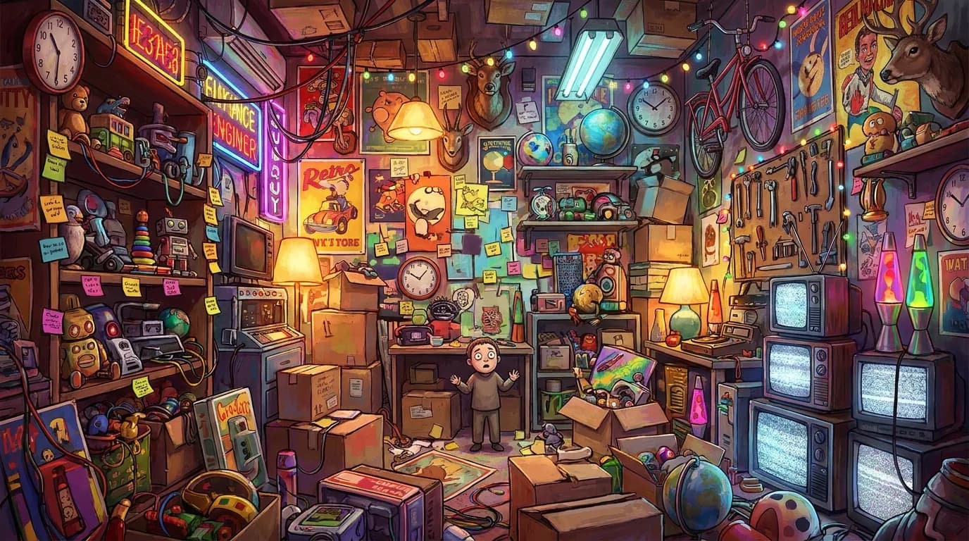
A clean, simple background keeps all the focus on your subject. Clear out busy details so your main idea reads instantly, even at thumbnail size. The more room your subject has to breathe, the stronger the pull toward a click.
Choose colors with complementary or analogous palettes
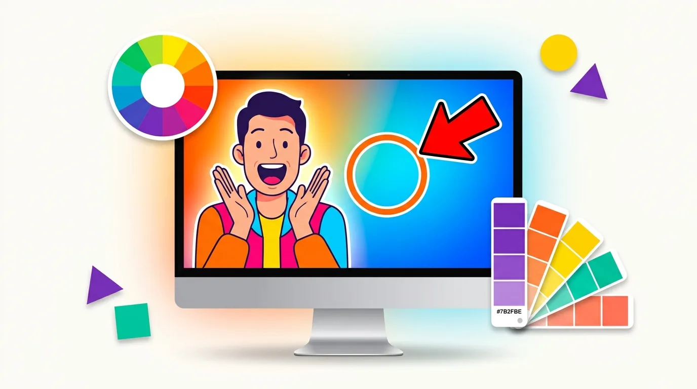
Complementary colors sit opposite each other on the color wheel and create eye-catching contrast, while analogous colors sit side by side for a calm, harmonious look. Choosing a palette on purpose makes your thumbnail feel designed. A little color theory goes a long way toward standing out.
One clear focal point tells viewers exactly where to look. A bright arrow, a bold circle, or a striking expression guides the eye to the heart of your video. Keep it to a single cue so your message stays sharp.
Most views start on a phone, where your thumbnail shrinks to a tiny preview. Check that your subject and text still read clearly at around 180 by 101 pixels. Designing for the smallest size makes your thumbnail work everywhere.
Describe your video and generate thumbnails with bold faces, high contrast, and clean layouts. Then refine your prompt until it clicks.
Thumbnail Design FAQs
Common questions about designing YouTube thumbnails that get clicks.
A high-CTR thumbnail leads with one clear idea. It pairs a bright, high-contrast subject with a large, emotive face, keeps any text to about three bold words, and uses a consistent color palette. Every element should still read clearly when the thumbnail shrinks to a small preview on a phone.
Aim for a face that fills roughly 40 to 60 percent of the frame. Faces grab attention faster than almost anything else, and a large, expressive one lets viewers feel the emotion of your video before they read a word.
Keep text to three words or fewer. Viewers skim thumbnails in a fraction of a second, so short, bold words read instantly and leave room for your subject. Save the details for your title and description.
YouTube recommends 1280 by 720 pixels in a 16:9 aspect ratio. Design at that size, then preview your thumbnail at around 180 by 101 pixels to make sure it still reads clearly on mobile, where most views begin.
Reach for high contrast between your subject and background, and choose a palette on purpose. Complementary colors like blue and orange create eye-catching contrast, while analogous colors create a calm, cohesive look. Keeping the same signature colors across videos helps viewers recognize your channel.
Use big, bold sans-serif text with a thick outline or drop shadow, keep the background simple, and lean on high contrast. Then shrink your thumbnail to a small preview and check that the subject and words still read. If they hold up small, they will hold up everywhere.
Ready to Create Amazing Content?
Start with 100 free credits. No credit card required. Upgrade anytime for more powerful features.
✓100 free credits✓No credit card required✓Plans from $15/month